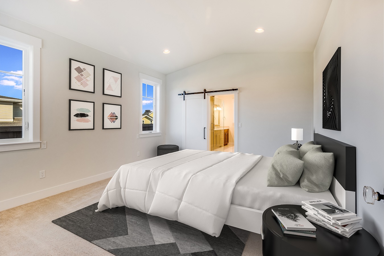
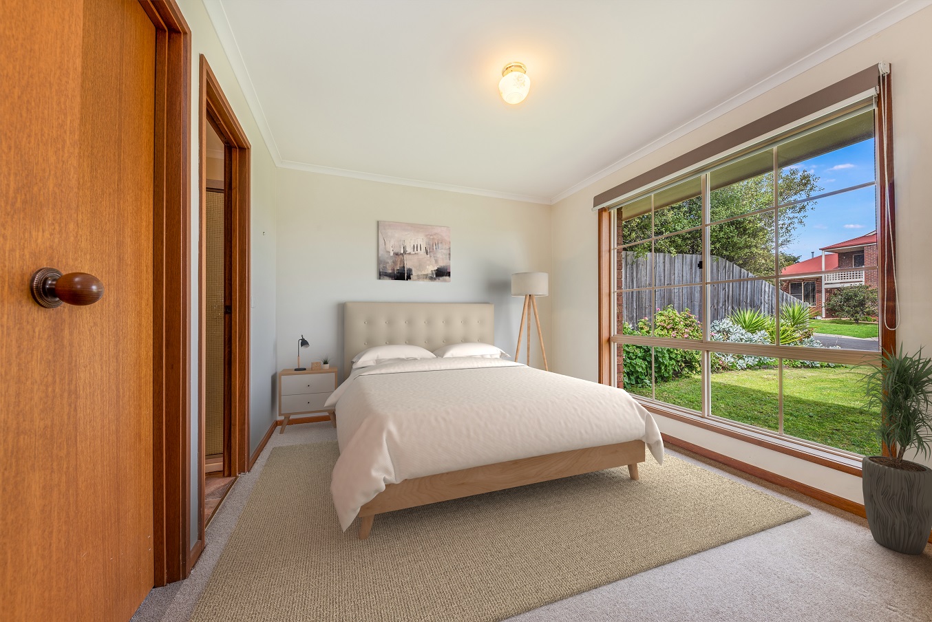
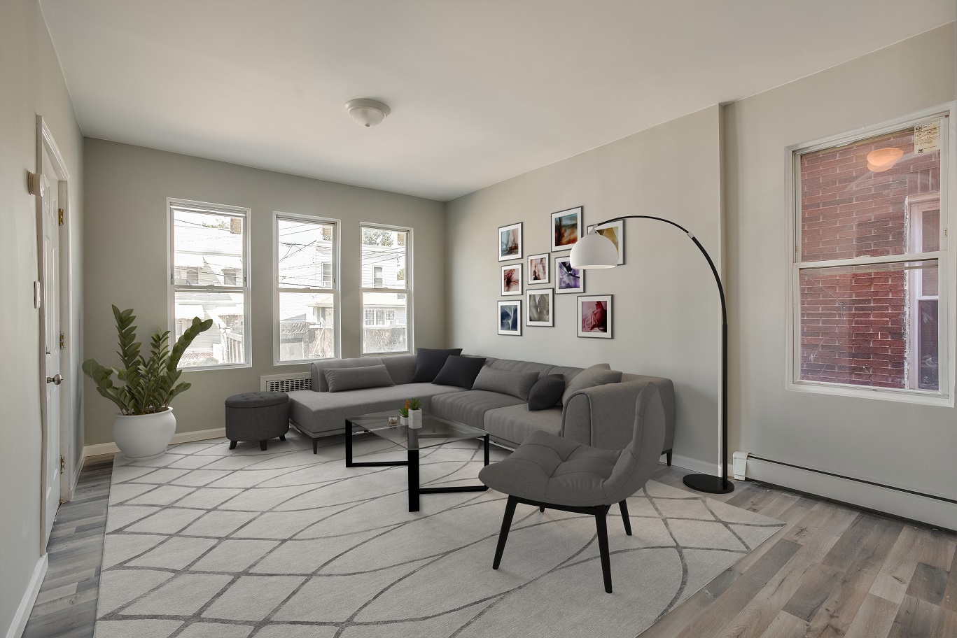
It’s easy to go overboard with virtual staging. You can avoid that by following these virtual staging rules.
Virtual staging is a fast, easy, and affordable way of staging a home so the property would be appealing to would-be buyers. Virtual staging also has many other benefits for real estate photographers.
The technique involves adding virtually designed furniture, appliances, and accents in a high-quality image of a vacant interior space. As a real estate photographer, adding virtual staging to your menu of services can help make you a one-stop shop for all your clients’ real estate marketing needs.
Virtual staging is in the same wheelhouse of computer aided design (CAD). And when it comes to this type of graphic design, there’s a natural tendency to go overboard, whether it’s the client’s instruction or designer’s intuition.
Here are 5 basic but essential virtual staging rules that you and your virtual stager need to be aware of.

1. Match the style of furnishings with the theme of the room
One of the rules of sensible interior design is to use pieces that go well together with the room. Sounds pretty straightforward, right? Well, the same holds true for virtual staging.
As a rule of thumb, furniture, decor, appliances, and accent pieces should match the physical space (aka, the home itself). For example, classic furniture goes well with a more contemporary-style home. But, classic furniture would certainly look out of place in a modern house with big floor to ceiling windows, stainless steel appliances, and an open floor plan.
Unsure of what style of virtual furniture to add to a vacant room? Check out magazines, websites, and photos that feature home decorating ideas and sensible interior design. Examples would be Houzz, Pinterest, or simply search for interior design photos on Instagram.
Looking for magazines to help inspire you? Check out Architecture’s Digest, Home and Garden, Ideal Home and more.
PhotoUp also offers an online catalog where you can choose thousands of pieces of furniture that you can add to your images.
2. Make sure the design is sensible and reflects reality.
Now we all know that virtual home staging is the process of blending elements of CAD into an image in order to make the image look realistic. However, taking the perfect real estate photo is the first step to producing a great virtual staging image.
A great virtual staging image will also take into effect the lighting and shadows once the furniture has been placed. Let’s say you took an interior shot of a master bedroom that features a large window facing East. In the image, sunlight streams through the window during the mid-morning sun. When adding furniture under the sunbeam, you would expect it to look brighter and there would normally be shadows cast along the floor and walls where the new furniture blocks the sunlight.
If the floor is made of polished marble, then there should be a light reflection of the furniture seen on the floor. The same goes for mirrors. If the furniture is truly part of the room, you would expect to see its reflection in the mirror, right?
All these effects should be seen in a great virtually staged image. Effects like these make your photos more convincing and will help you sell more virtual staging services to your clients. The best virtual staging companies out there will be aware of these effects and make sure they are included in every image.

3. Limit the number of furnishings or decorations.
Have you ever furnished or decorated a newly renovated room in your home? In your excitement to liven up the place, it’s common to add furniture, appliances, or accents to the room. In the end, the room may seem cluttered and busy. Not exactly what you were going for, right?
The same goes for virtual staging. It is easy to go overboard due to a number of factors—excitement, that nagging thought that “it is not enough”, or the desire to put a plant on every shelf and a picture on every wall.
By doing this, you can make the final image look too overwhelming and flashy.
Resist the temptation to have the stager put virtual furnishings in every square inch of space. Remember that you are trying to give the potential property buyer an idea of what their new home could look like.
The virtual furniture in the photo may not be to his/her liking, but they’ll enjoy having something to reference when deciding what furniture they want to put into each room when they move in.
So, take our advice and keep it simple when virtually staging a room. Your clients and potential home buyers will appreciate it.

4. Know your clients
When virtually staging an image, it’s important to know what your client wants when it comes to virtual furniture. What style of furniture do they like? Are they particular about the furniture they want in each room? Do you need to send them a virtual furniture catalog and let them pick our furniture in advance OR do they let you have full control as to what looks best?
At the end of the day, your job is to make your clients happy. Knowing their style and preferences in advance will help you provide them with a virtual staging image that they’re sure to love.
5. Minimize adding your personal touches
Sure, you want to have a “signature” touch for personal branding. But often, this can become a hindrance instead of helpful. Remember, you are virtually staging a photo to sell a property, not to impress your clients with your love of excessive foliage or affinity for zebra print rugs.
Resist the urge of putting something personal in these photos and focus more on making your clients love the images you give them.
By simply being aware of the rules mentioned above, you’ll be on the right track to selling more virtual staging images and providing even more value to your best clients.


